Company Information & History
-
Company Information
-
History
-
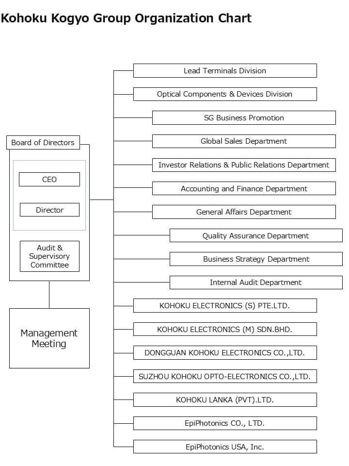
Organization Chart
-
Directors and Officers
-
Corporate Mark
-
Corporate Color
-
Company Information Brochure
History
Organization Chart
Directors and Officers
| Position | Name | Responsibility / Remarks |
|---|---|---|
| President & CEO | Futoshi Ishii | CEO |
|
Senior Executive Director & Assistant CEO Senior Managing Corporate Officer |
Kazukiyo Kitagawa |
Lead Terminals Division, SG Business Promotion, Global Sales Department General Manager, Lead Terminals Division |
| Director & CFO | Seiji Nakamura | Accounting and Finance, General Affairs, Investor Relations & Public Relations, Business Strategy Department |
| Director | Shoko Sawaki | Outside Director |
| Director | Masayuki Arai | Outside Director |
| Director | Dieter Sommerhalder | Outside Director |
| Director (Audit & Supervisory Committee) | Yutaka Kuriyama | Outside Director, Member of the Audit & Supervisory Committee |
| Director (Audit & Supervisory Committee) | Masaya Nakamura | Outside Director, Member of the Audit & Supervisory Committee |
| Director (Audit & Supervisory Committee) | Yasushi Kozu | Outside Director, Member of the Audit & Supervisory Committee |
| Managing Corporate Officer | Takashi Kato | General Manager, Optical Components & Devices Division |
| Corporate Officer | Takashi Kato | General Manager, Optical Components & Devices Division |
| Corporate Officer | Akihiro Sasabe | Deputy General Manager, Lead Terminals Division |
| Corporate Officer | Yukito Sugiyama | General Manager, SG Business Promotion |
| Corporate Officer | Manabu Kakida | Managing Director, KOHOKU LANKA (PVT) LTD. |
| Corporate Officer | Yuichi Nishikoji | General Manager, Global Sales Department |
| Corporate Officer | Tomoaki Toriya | Deputy General Manager, Optical Components & Devices Division |
| Corporate Officer | Kohei Nozato | General Manager, Investor Relations & Public Relations Department |
| Corporate Officer | Toshihiro Tanaka | General Manager, Accounting and Finance Department |
| Corporate Officer | Masaya Nakamura | General Manager, Corporate Planning Department |
| Corporate Officer | Kosuke Nakanishi | General Manager, General Affairs Department |
Corporate Mark

Corporate Color
Blue 1
Blue 2
Blue 3
Black
The corporate color of Kohoku Kogyo is a combination of three kinds of blue, deep blue named as “KOHOKU Blue 1”, the main color, which symbolizes “reliability”, bright blue named as “KOHOKU Blue 2” showing the image of the place of foundation, Lake Biwa, and “KOHOKU Blue 3” which represents the fresh sky.
“Ultra-marine blue” is used as “KOHOKU Blue 1”, which is very special among blue colors that represent “honesty” and “reliance” in terms of color psychology.
This color is also called Vermeer blue because it was used in great painter Vermeer’s immortal work “Girl with a Pearl Earring.” There is no other blue with such a deep tone. It represent Kohoku Kogyo’s corporate philosophy “Creation of unique values”.
Company Information Brochure

The corporate mark of Kohoku Kogyo was designed from the initial letter of the company name “K” and the diamond shape is associated with the “parallel crosses” of the old company mark, indicating the attitude of inheriting the corporate philosophy since the time of foundation eternally. The diamond shape also suggests all directions and symbolize a company that expands from the north of Lake Biwa to the world. The four sides of diamond shape also represent new four corporate slogans “consiotency, reliable, state-of the-art, and international.”
The three lines laid out in the diamond shape simply express “K,” the initial letter of the company name, which represents not only niche (= gap) but also three management philosophies “all-type management respecting rich originalities,” “creation of new values,” and “aiming for an only-one company.” The lines which extend from the center to the outside are designed to indicate the images of the development to the world and the persistence of Kohoku Kogyo.